Description[]
Background: Warner Bros. Pictures was founded in 1918 by brothers Harry, Albert, Sam, and Jack Warner - Polish-Jewish brothers who emigrated from Krasnosielc, Poland to Ontario, Canada. It is the third-oldest American movie studio in continuous operation, after Paramount Pictures and Universal Studios (both founded in 1912). Warner Bros. incorporated on April 4, 1923. The studio has been the subject to numerous acquisitions over the decades. Warner Bros. merged with Seven Arts Productions in 1967, renaming it to "Warner Bros.-Seven Arts". The studio was purchased by Kinney National Co. in 1969, which was later reincorporated as Warner Communications in 1972 when it spun off its non-entertainment assets, due to a financial scandal over its parking operations. Since 1989, it is a subsidiary of Time Warner (WarnerMedia since 2018), formed as a merger between the conglomerates Time, Inc. and Warner Communications. In 1992, Time Warner formed "Time Warner Entertainment" by merging all of its entertainment operations for the first time. Internet giant AOL merged with Time Warner in January 2001, renaming the company as AOL Time Warner, but in summer 2003, the conglomerate name was reverted back to Time Warner (often with no space in between the words) due to lawsuits and losing $99 billion from the collapse of the dot-com bubble. AOL officially split from Time Warner in 2009. In 2018, after numerous legal hurdles, AT&T acquired Time Warner. Subsequently, it was rebranded "WarnerMedia". The status of the acquisition was settled in February 2019 when it was upheld on appeal and the Justice Department declined to pursue their case against the acquisition any further. In May 2021, AT&T announced that it would spin-off its media properties to Discovery, Inc., creating the combined company "Warner Bros. Discovery". Today, with the exceptions of some films WB merely distributed, such as Sayonara (currently owned by the estate of the producer), Moby Dick (currently owned by MGM), Rope (currently owned by Universal Pictures) and Hondo (owned by Batjac Productions with distribution exclusively handled by Paramount Pictures), the pre-1950 catalog is held by WB subsidiary Turner Entertainment.
1st Logo
(August 1, 1925-March 24, 1929)[]
")
")
")
")
Nicknames: "Brain Shield", "Studio Shield", "WB Shield", "Brain WB Shield", "Early WB Shield"
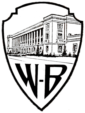
Logo: On a black background, a large, bizarrely shaped shield is seen, with a very wide top. The top part of the shield shows a picture of the Warner studio in Burbank CA, the bottom having a squashed, stylized "WB". "A WARNER BROTHERS" is above the shield (with "WARNER BROTHERS" in an arc around the shield, a la the first Columbia logo), with "CLASSIC of the SCREEN" below. Starting in 1926 or so, it changed to "PRODUCTION".
Closing Titles: There are two closing titles for this WB era:
- 1st Closing Title: We see the words "THE END" all in capitals on both sides of the WB shield, with "THE" on the left and "END" on the right. The "T" on "THE" and the "E" on "END" are bigger than the other letters. Below the shield, we see "A WARNER BROTHERS CLASSIC OF THE SCREEN" in big capital letters. But on some movies, the WB shield was omitted. For example, Beau Brummell (1924) had a BG with some books and two candles on both sides of the screen. Above the books, we see the "The End" in a small, fancy white script arched above a small "A WARNER BROTHERS "CLASSIC of the SCREEN"" text.
- 2nd Closing Title: The second variant is the one you are seeing on the 3rd photo from left to right. On The Jazz Singer (1927), it was superimposed on a marble-like BG.
FX/SFX: None.
Music/Sounds: None or the film's opening theme.
Availability: Extremely rare. This logo was thought to have been extinct for years. Evidence of it was seen on a Warner Bros. 75th Anniversary trailer on 1998 Warner Home Video VHS releases. However, it has appeared at the start of the film The Jazz Singer, and was kept intact on the 75th Anniversary DVD as well as on the 1981 Magnetic Video release, where it's preceded by a United Artists "Transamerica T" logo. This is retained on all extant silent-era Warner Bros. films shown on TCM such as The Better 'Ole. The logo premiered at the beginning of Kiss Me Again and made its final appearance on Queen of the Night Clubs.
Editor's Note: The first design of the WB shield, it's noted by modern viewers for having a strange look to it. However, the addition of the WB Studios inside the shield wouldn't be referenced again until the 1998 logo.
2nd Logo
(November 7, 1929-August 29, 1936)[]
")
")
")
")
")
")
Nicknames: "Vitaphone Shield", "Shield and Flag", "WB Shield II", "WB Shield and Vitaphone Flag"
Logo: The words "WARNER BROS. PICTURES, Inc." appear, and below that "& THE VITAPHONE CORP." appears in a much smaller font, with the "VITAPHONE" using "electric" style letters. Below that is a very small WB shield (using the stylized WB seen in logo 1), and in script, "Present". Behind it there is the drawing of a flag, "waving" so it looks like it is in three sections. On the first one, "WARNER BROS." appears, followed by the electric-letter "VITAPHONE" logo and on section 3, "PICTURES".
Closing Titles:
- The closing variation has "The End" instead of "Present".
Trivia: The First National Company also used this logo, but modified with the words "FIRST NATIONAL" instead of "WARNER BROS. PICTURES". Also, on some features, only a very big banner saying "VITAPHONE", was shown, omitting the First National or the Warner Bros. logo.
FX/SFX: None.
Music/Sounds: None.
Availability: It's preserved on any film from Warner Bros. from this era, including pre-1999 video releases by Magnetic Video, CBS/Fox Video, Key Video, and MGM/UA Home Video. However, on the DVD version of G-Men, it has usually been replaced with the 1948 shield logo, although this logo is kept at the end. The logo premiered on Paris and made its final appearance on Anthony Adverse. It remains intact on Svengali, 42nd Street and Mystery of the Wax Museum.
3rd Logo
(July 21, 1934-December 18, 1937)[]
")
")
")
")
")
Nicknames: "Zooming Shield", "WB Shield III", "Zooming WB Shield", "Shield in the Sky"
Logo: Over a cumulonimbus cloud setting, a superimposed WB Shield design zooms in to the screen. The words "WARNER BROS. PICTURES, Inc. Present" appear over the shield.
Variants:
- For colorized releases, most notably Captain Blood, the cloud background is blue and the shield is yellow.
- On Here Comes the Navy, Housewife and Dames (all 1934), the shield is seen on a white backdrop. Instead of the shield zooming into the camera, the opposite takes place.
- On The Woman in Red (1935), the shield appears without the words.
- On The Goose and the Gander (1935), the shield is a still image, and is shaped extremely bizarrely.
Closing Title: We see, on a special BG, superimposed on the last scene of a movie or the cloud background of the opening logo, the words "The End" in a fancy script font, with either the WB or the FN logos and "Warner Bros. Pictures, Inc.", or rarely "Warner Bros. Productions Corporation", or "First National Pictures, Inc." below. Later, the disclaimer changed to either "A First National Picture" or "A Warner Bros. Picture" and the font for "The End" would change different times.
FX/SFX: The shield zooming in. Could it be that this is what inspired the Looney Tunes "Bullseye" opening titles? It's a possibility.
Music/Sounds: The opening theme of the movie.
Availability: Very rare. It's seen on films from the period and occasionally seen on TCM. Its first known appearance is on Here Comes the Navy and it was last seen on She Loved a Fireman.
Editor's Note: Elements of this logo (the zooming shield especially) have been implemented in the opening of Looney Tunes cartoons, which are regarded to be iconic. The zoom-in of the shield is rough, which is typical for logos made before the Scanimate era.
4th Logo
(November 27, 1937-July 3, 1948)[]
")
")
")
")
")
")
")
")
")
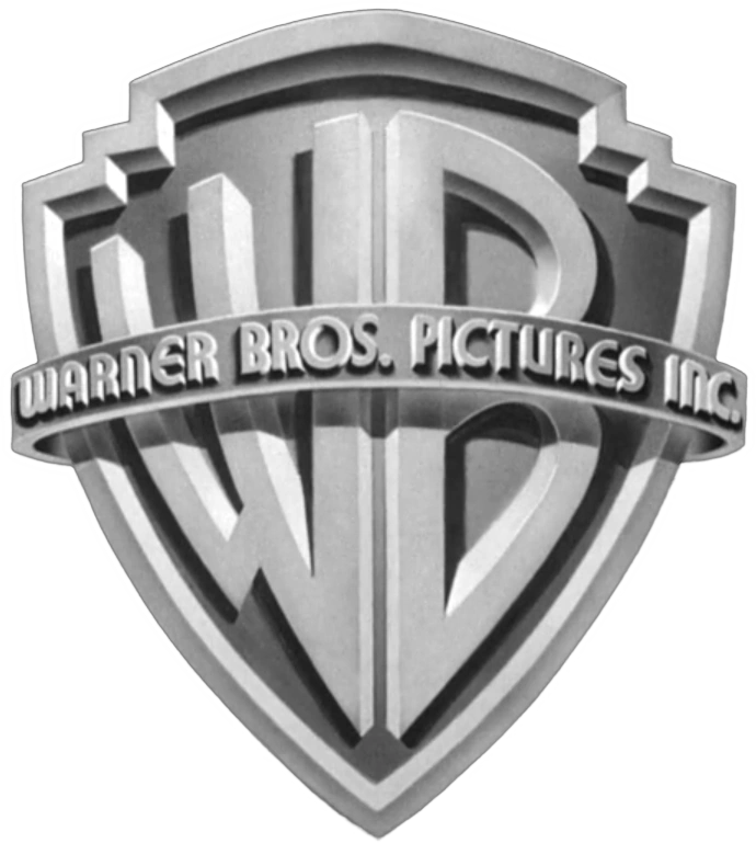
Nickname: "WB Shield IV"
Logo: Inside a shield, a more realistic version of the stylized "WB" as seen in the previous logo appears. Over the shield is a banner that reads "WARNER BROS. PICTURES, INC." Below the logo is the word "Presents" in script.
Variants:
- For Technicolor releases, the shield is sepia-toned and on a red background.
- Starting in 1942, "JACK L. WARNER, EXECUTIVE PRODUCER" was seen below the Warner Bros. Pictures banner.
- Starting in 1944, the word "PRESENTS" is now in the same font as the Warner Bros. Pictures banner.
- A colorized version of this logo exists on color prints of The Maltese Falcon and Casablanca.
- An ornate hand-drawn version of the shield against a parchment-like background was seen on some films, such as The Adventures of Robin Hood and The Private Lives of Elizabeth and Essex.
Closing Title: Superimposed on a special background or sometimes on the last scene of the movie, the huge words "The End" (with font varying on a movie) fade in, with the "WB" shield bug and "A WARNER BROS. PICTURE" in small letters below, but sometimes, due to the deal between WB and First National Pictures, the disclaimer was "A WARNER BROS.-FIRST NATIONAL PICTURE", or it was sometimes shortened to "A FIRST NATIONAL PICTURE" with the WB shield bug intact.
FX/SFX: None.
Music/Sounds: Usually the beginning of the movie's theme, or a majestic horn sounder, composed by Max Steiner. On at least two Humphrey Bogart films, To Have and Have Not and Dark Passage, a different fanfare, composed by Franz Waxman, plays.
Availability: Fairly common. It's seen on Warner releases of the period, like Casablanca on TCM. It premiered on Submarine D-1 and made its final appearance on Romance on the High Seas.
Editor's Note: Perhaps the second most well known version of the shield, due to being placed at the front of such classics as Casablanca, The Maltese Falcon, and The Treasure of Sierra Madre, all starring Humphrey Bogart, who was rated as the Greatest American Movie Star (Men's Category) by the American Film Institute in 1998.
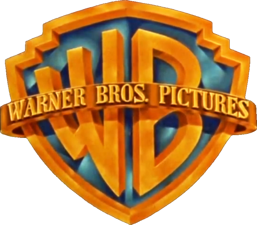
5th Logo (July 16, 1948-November 1, 1967)[]
") ") ") ") ") |
|---|
Nicknames: "The Classic Shield", "The Golden Shield", "WB Shield V", "Shield in the Sky II"
Logo: Same as before, only the design has been cleaned up a bit. The border of the shield, banner, text, and "WB" are now gold, and the inside of the shield is now blue. The banner phrase is now changed to "WARNER BROS. PICTURES" and is now gold. "Presents", in the same font as the previous logo, usually appears below. Also, the background is now a cloud skyline (much like the logos of 1984 on). For the later years, this logo was usually superimposed onto the titles of Warner features of this period.
Variants:
- A color version of this logo appears on color releases, such as Rope, among others.
- There were many different cloud background variants throughout the years.
- A sepia-toned variant of this logo can be found on Jack and the Beanstalk and Bonnie and Clyde.
- Some movies, most notably The Crimson Pirate and The Master of Ballantrae, had this logo on a different cloud background.
- On some 3D films, films that were originally planned to be made in 3D, or the occasional film intended for 2D like House of Wax, Hondo, the 1954 A Star is Born, Dial M for Murder, Them!, The High and the Mighty, and Rebel Without a Cause, the WB shield looks more three-dimensional. It was also used for logo plastering, as was the case for reissue prints of the 1951 film Force of Arms (aka A Girl for Joe).
- One film that had the "Presents" text absent is Alfred Hitchcock's Under Capricorn.
- Some movies, most notably Battle of the Bulge and Cool Hand Luke, had the logo on a black background.
- Sometimes, the banner reads "WARNER BROS. PICTURES INC." like the previous logo (with "INC." written in a much smaller font size). This can be seen on some movies, such as Moby Dick, The Curse of Frankenstein and The Prince and the Showgirl.
Closing Titles:
- 1st Closing Title: Was the same as above, seen only with the "A Warner Bros.-First National Picture" and "A First National Picture" text.
- 2nd Closing Title: Superimposed on the last scene of a movie or a special BG, the words "The End" with font varies on that movie fades in with the WB shield bug between two thick lines below. Sometimes, the following disclaimers were used:
- "Produced and Distributed by Warner Bros. Pictures, Inc."
- "Produced by Warner Bros. Pictures, Inc."
- "Produced and Distributed by Warner Bros. Pictures"
- "Distributed by Warner Bros."
- These texts are seen sandwiched below "The End" and above the WB shield bug.
FX/SFX: None.
Music/Sounds: The Max Steiner fanfare from the previous logo was used initially, and it was gradually phased out in favor of the movie's opening theme.
Music/Sounds Variant: On New York Confidential, the logo had a different fanfare, composed by Joseph Mullendore.
Availability: Seen on many of the Warner Bros. movies on AMC and TCM. It has also been plastered onto the DVD version of G-Men. It premiered on Key Largo and was last used on Cool Hand Luke (but copyrighted to Warner Bros.-Seven Arts, as the merger had finished by the time the film was completed). Sometimes, this may be preceded by a later logo, as seen on the earliest home video releases of Them! (where the 10th logo preceded this one). This also appears on the VCI release of Drum Beat.
Editor's Note: The most well known version of the Warner Bros. Shield. This particular design was listed as the 12th best corporate logo by Complex Magazine, for its longevity and "iconic" status.
6th Logo
(January 20, 1968-November 12, 1970)[]

")
")
")
Note: The print and on-screen logos are seen.
Nicknames: "WB-7", "W7", "Lucky Number 7 on WB", "W7 Shield"
Logo: Just a superimposed, stylized shield which can be white, yellow or red. The shield features a combination of a "W" and a "7", representing Warner Bros.-Seven Arts. The "W7" is often drawn on-screen, a la the NBC Snake, although it's a still logo on a few films. Below the shield, "WARNER BROS.-SEVEN ARTS" is seen. The word "Presents" fades in underneath shortly afterwards.
Variants:
- A couple of movies, like Dracula Has Risen from the Grave (1968) and Frankenstein Must Be Destroyed (1969), have a still version of the logo.
- A couple of European movies, that were distributed by Warner Bros., like Alexandre le bienheureux (1968) and The Bastard (1968), have only the letters without the shield outline. On The Bastard, the logo is on a cloudy background like the previous logo.
Closing title: After the words "The End" and the credits, the words "Distributed by Warner Bros.-Seven Arts" are seen in the screen superimposed in the last scene of the movie or a special BG with the W7 shield bug below.
FX/SFX: The "trace"; sometimes done over the backdrop of a specific movie's opening scene.
Music/Sounds: None or the opening theme of the movie.
Availability: Rare.
- It's seen on some Warner Bros. films of the period, though WB usually replaces it with a newer logo. Examples of this include pre-1998 prints of Bullitt (the 1980 WCI Home Video release notwithstanding), which plaster it with the 1984 Warner Communications "Shield of Staleness," and both the WCI release of The Green Berets and the 1984 WHV VHS of Start the Revolution Without Me, where the Big W plasters it.
- The 2005 DVD and 2007 Blu-ray releases of Bullitt, and current prints of The Wild Bunch have their logos intact/restored.
- It also appeared after the 1984 Warner Communications shield logo on an international TCM airing of The Arrangement, but the DVD and American prints have the 1999 logo.
- It premiered on The Vengeance of Fu Manchu and made its final regular appearance on Last of the Mobile Hot Shots, subsequently appearing on Frankenstein Must Be Destroyed, Moon Zero Two, Once You Kiss a Stranger, The Phynx, Crescendo, and The Rise and Rise of Michael Rimmer.
- Don't expect this to appear on Reflections in a Golden Eye or Camelot; despite these being the first two films distributed under W7, they only use in-credit notices.
Editor's Note: This is the first time the WB name (and its logo) had been altered in its 50+ year history.
7th Logo
(February 4, 1970-February 25, 1972)[]

")
")
")
")
Note: This is a red background print variant as the image.
Nicknames: "Gasoline Shield", "Shield Stretch", "The Kinney Shield", "Long Shield", "The Kinney WB Shield"
Logo: Over a blue screen is an abstract shield (like those seen on WB movie posters in the '60s) in a golden color with a dark brownish color inside. A simple lettering of the WB appears at the upper part and a rectangle of the same colors appear at the lower part of the shield, with the Kinney byline inside. The word "PRESENTS" appears underneath the logo.
Bylines:
- May 13, 1970-June 25, 1971: "A KINNEY NATIONAL COMPANY"
- April 18-May 1, 1971: "A KINNEY SERVICES COMPANY"
- June 17-September 30, 1971: "A KINNEY LEISURE SERVICE"
- December 19, 1971-February 25, 1972: "A KINNEY COMPANY"
Variants:
- At the end of the film, we sometimes see the byline "Distributed by WARNER BROS." or "Distributed by WARNER BROS. INC." on top of (or in the case of THX 1138, underneath) a superimposed rendition of the company logo. (On earlier films from 1970, such as Chisum and The Battle of Cable Hogue, there is no banner/byline on the superimposed version.)
- Some films (including There Was a Crooked Man... and THX 1138) had the logo on a black background.
- Others (such as The Omega Man) had it superimposed over the opening credits.
- Dirty Harry and Billy Jack do not have the "PRESENTS" text.
- Some films had a two-dimensional version of the shield appearing in white over a black background.
- On the 1970 re-release print of Giant, the Kinney Shield was set over a cloud background. It is unknown if this appears on any home video release.
- A German version exists. Here, the shield looks cheaply made.
FX/SFX: None.
Music/Sounds: The opening/closing theme of the movie or silence.
Music/Sounds Variant: On The Cowboys, several stringed instruments blare a single note, which fades in and out for the logo's duration.
Availability: Very rare. As we all know, Warner was incredibly shoddy with logo preservation until recently.
- It premiered on Start the Revolution Without Me and made its final appearance on Dealing: Or the Berkeley-to-Boston Forty-Brick Lost-Bag Blues (What's Up, Doc?, the next film WB released, instead uses the classic WB shield as an in-credit logo, and would be the first film to use the Warner Communications byline).
- The logo is retained on the DVD releases of The Omega Man (as well as an early VHS release), The Cowboys, Billy Jack, and THX 1138. It is also preserved on the Blu-ray release of the first Dirty Harry film.
- No logo is seen at all on the 2007 DVD/Blu-ray release of A Clockwork Orange, though the 2000 DVD release contains it.
- AMC and TCM showings of Warner movies may include this logo, but expect one of the more recent WB shield logos, most likely the Warner Communications and Time Warner (not Time Warner Entertainment) variations. One notable exception is AMC's print of Dirty Harry, which preserves it.
- It is also seen on Starz Encore Westerns' print of the John Wayne film Chisum, as well as There Was a Crooked Man... and Death in Venice (plastered by the 1972 logo on the 1981 VHS of the latter).
- The cheaper German shield version was found on a 28th of August, 1982 ARD airing of There Was A Crooked Man....
- The Kinney Services byline, the rarest of the byline variants, appeared on Billy Jack, and is also presumed to have appeared on Zeppelin and Summer of '42.
Editor's Note: The shield's simplistic design reflected the style of other logos produced in this time frame. It appears the reason why this was plastered so often is because Kinney still existed as a company at the time, having spun off Warner Communications following a parking scandal, similar to what happened with United Artists and its Transamerica logos.
8th Logo
(November 24, 1971)[]
Nicknames: "Alternate Kinney Shield", "Off-Kilter Shield", "WB Shield VI", "Bannerless WB Shield"
Logo: On a background similar to the last logo, a bannerless WB shield is seen, with the design being closer to the classic WB shield. The byline "A KINNEY LEISURE SERVICE" is seen below.
FX/SFX: None.
Music/Sounds: The opening theme of the movie.
Availability: Extremely rare.
- Only known to appear on one film, Man in the Wilderness, which is preserved on its Warner Archive Blu-ray release.
- May have been seen on other films from this time period, but it's hard to say between Warner's rampant plastering habits and more common usage of the previous logo. Not helping matters is that even Man in the Wilderness used the original Kinney shield as its closing logo. However, the print version of this logo was spotted on the Italian version of The Priest's Wife, using the "KINNEY NATIONAL COMPANY" byline.
Editor's Note: Quite an oddity given that this only appears on one film. Nonetheless, The shield looks very ugly, and might surprise those who were expecting the previous logo.
9th Logo
(May 24, 1972-January 31, 1973)[]

")
Nicknames: "WCI Shield", "Early WCI Shield", "Tiny Shield", "Mini Shield", "WB Shield VII", "Bannerless WB Shield II", "The Golden Shield II"
Logo: The standard WB shield logo, without the banner. It is on a blue background with "A WARNER COMMUNICATIONS COMPANY " underneath. "Presents", in script, may appear below
Variants:
- On the 1986 VHS release of Deliverance, the aspect ratio of the logo was changed from 2.35:1 squeezed into 4:3 full screen.
- On Get to Know Your Rabbit, the logo is darker and slightly tilted to the left.
- On the 2007 DVD and Blu-ray of Deliverance, "Presents" underneath the byline is not present. This is likely due to said release using the original negative as the basis for its restoration as opposed to a 35mm inter-positive.
FX/SFX: None.
Music/Sounds: Silence or the beginning of the movie's theme.
Availability: Ultra rare. This was on only a few movies to begin with (notably Deliverance, The Candidate, and Super Fly) and has usually been plastered with the 1984 logo in any of its variations, so it's hard to say. This is retained on the latest home video releases of The Candidate and Deliverance, along with airings of the latter on TCM Australia and Fox Classics (the latter in widescreen!). The logo is also preserved on Warner's 1986 VHS and Betamax release of Rage, along with the Nineties VHS releases of Super Fly and Dracula A.D. 1972. It premiered on Malcolm X (1972) and made its final theatrical appearance on Steelyard Blues.
Editor's Note: An attempt to bring back the classic WB shield. Scrapped in favor of the corporate logo a year later.
10th Logo
(February 7, 1973-1989)[]

")
")
")
Nicknames: The Big "W", "(\\')", "The Worms"
Logo: On a black background, a red abstract "W" consisting of two slanted elongated circles and a shorter elongated circle zooms in towards us. Around halfway through, the words "WARNER BROS" (in the Warner Communications custom typeface) appear below it. The red logo overtakes the screen as a smaller white "W" zooms in. It stops at the middle of the screen and a black square field, whose corners have been rounded and softened, fades in around the logo. "A WARNER COMMUNICATIONS COMPANY" in the same font fades in below. Most of the time, "PRESENTS" fades in below after that (in Helvetica).
Trivia: The Big \\' was designed by Saul Bass, who also designed the Geffen "G" logo. The "Worms" nickname originated on an audio commentary for Gremlins, which was one of the first movies to use the next WB logo.
Variants:
- On All the President's Men, the logo is in black-and-white and "PRESENTS" is absent. This variant was plastered by the standard version on a 1986 Canadian VHS print and the following logo on its 1997 DVD, though the 2006 release keeps it intact.
- Most times, "PRESENTS" fades in after the logo is formed. On some films (including The Bugs Bunny/Road Runner Movie, The Frisco Kid, Just Tell Me What You Want, The Looney, Looney, Looney Bugs Bunny Movie, The Man with Two Brains, National Lampoon's Vacation and Daffy Duck's Movie: Fantastic Island), "PRESENTS" fades in at the same time as the byline.
- On Superman: The Movie and Beyond the Poseidon Adventure, a white (\\') zooms in on a black background and stops in the middle. The words "RELEASED BY WARNER BROS" fade in below. (Superman retained this on early video releases, but it was replaced by the regular version on later releases, and the 1984 "PRESENTS" version of the shield on video releases from 1986 onward. It was restored on the film's DVD and Blu-ray releases, though Encore HD airings replace it with the variant seen on Flags of Our Fathers.)
- On some other outside productions released by WB (including Superman II and 'III, among others), "RELEASED BY WARNER BROS" replaces "WARNER BROS" at the beginning of the logo. (This version was retained on the original video releases of Superman II and III, along with the 2023 4K Blu-ray releases of both films.) Both the "RELEASED BY WARNER BROS" text and the byline are in a different font in this variant.
- On the original version of The Exorcist, the logo is austerely presented over a black background.
- On Exorcist II: The Heretic, there is a still image of a black \\' inside a red square field, with "WARNER BROS, A WARNER COMMUNICATIONS COMPANY" below in red.
- On some prints of Night Moves and Dog Day Afternoon, as well as the 1979 WCI VHS print of East of Eden, the word "PRESENTATION" appears below the byline, making the phrase "A WARNER COMMUNICATIONS COMPANY PRESENTATION".
- Although Steelyard Blues opened with this logo, it still used an in-credit "Distributed by" version of the early 1972 WB logo at the end.
- On the 1984 VHS release of Class of '44, the logo was squeezed from its original 2.35:1 aspect ratio into 4:3 fullscreen.
- On trailers for re-releases, the logo has a copyright notice at the bottom, while on the top it says "A RE-RELEASE FROM WARNER BROS.". This has been seen on reissue trailers of Superman: The Movie and Around the World in 80 Days.
- On The Swarm, the scope version of the logo is seen unmatted at 1.78:1, showing the logo and the red background at a much farther distance.
- Original 1981 home video prints of The Prisoner of Second Avenue have this logo at the end of the film, even though it had an in-credit version of the WB Distribution logo at the end.
- The Kitchen uses the 7th logo's shield without a byline, with the WarnerMedia byline in the banner, and without any bottom text.
- On the 1979 VHS of East of Eden, the logo is cut to its last few seconds.
- Joker used a modified version of this logo, featuring a more-realistic look and the wordmark "WARNER BROS. PICTURES" and the WarnerMedia byline appear and fade in below.
Closing Variants:
- The closing "DISTRIBUTED BY WARNER BROS" logo has the colors inside out, with the "W" in black and the field in white.
- An early version of this logo had a different font for the text as well. (This version appeared at the beginning of some prints of The Shining.)
- A black-and-white version appeared at the end of TCM's print of Onionhead, followed by the 2003 Warner Bros. Television logo.
- An early September 1996 ITV overnight showing of the 1968 film The Heart is a Lonely Hunter had its original W7 logo at the beginning, but this logo, with "PRESENTS", oddly appeared at the end.
- Some early WCI Home Video releases have this closing variant sloppily tacked on at the end of some features, and replacing the Warner Bros. distribution logo at the end of early video prints of Mister Roberts and replacing the National General Pictures distribution logo at the end of the WCI print of Executive Action.
FX/SFX: The zooming in of the W. Very effective animation that holds up decently today. None for the closing variant.
Music/Sounds: Usually silent, but some movies have the beginning of the movie's theme playing over it (or in the case of The Gumball Rally, motor noises, as its opening theme doesn't begin until after the logo fades out).
Availability: Rare.
- It premiered on The Train Robbers and made its final regular appearance on Lassiter, subsequently appearing on Finders Keepers and Irreconcilable Differences (as seen on the Vestron Video release and the 2009 Lionsgate DVD, as it uses the same VHS master).
- Warner Bros.' editing bug in the '80s and early '90s meant that Warner Communications and Time Warner shield logos were seen over this logo and, ironically enough, that this did some plastering of its own back when it was the current logo, as seen on early WCI/Warner VHS and Betamax releases of The Green Berets (originally had the 6th logo) and The Candidate (originally had the 9th logo).
- WB sometimes continues to plaster this logo with newer ones, even into the 21st century, due to the fact that Warner Music Group (which later split from the film division and is now an entirely separate company) uses the \\' as their logo. Examples include The Bugs Bunny/Road Runner Movie, The Looney, Looney, Looney Bugs Bunny Movie and Daffy Duck's Movie: Fantastic Island, which all have it replaced with the extended 2004 WB Family Entertainment logo.
- On the 2008 DVD and 2016 Twilight Time Blu-ray of Bobby Deerfield (a co-production of Columbia Pictures and Warner Bros.), this logo is plastered by the 12th logo; however, the 1976 Columbia logo (which comes before the Warner Bros. logo) is kept, resulting in one of the strangest logo combos ever. It should be mentioned that the original VHS release, however, only has this logo, as no Columbia logo is seen.
- A few movies on Encore contain this logo (Oh, God! is one) after the 1992 WB logo.
- The 2007 remastered edition of the Led Zeppelin movie The Song Remains the Same retains this logo, and you can find this logo on early VHS, Laserdisc and Betamax releases by WCI/Warner Home Video.
- The 1984 VHS and some TV prints of What's Up Doc? has the "PRESENTS" variation of this preceding a variant of the logo.
- The 1986 VHS of Superman: The Movie has that film's variant plastered by the "PRESENTS" variant of the 1984 logo, though early video prints, as well as DVD and Blu-Ray prints, keep this intact; however, it is unknown if any TV airings in the past or present retain this as well.
- The 1980 WCI Home Video videocassette, 1991 letterboxed French Canadian Warner Home Video videocassette, and 1997 Warner Home Video DVD releases of All the President's Men preserve the B&W/color-faded variant.
- On AMC's prints of the Dirty Harry films Magnum Force, The Enforcer, and Sudden Impact, this logo is retained, though the latter two films have their logo edited due to time. These are also intact on their DVDs.
- Also seen intact on the HBO Family print and Amazon release of The Bugs Bunny/Road Runner Movie, a 1997 reprint of the 1990 VHS of Oh, God!, the 1999 VHS releases of Badlands (also on the DVD release) and Twilight Zone: The Movie, most WCI releases, earlier and some later WHV releases, and the 2-disc DVD of Enter the Dragon.
- Also preserved on DVD releases of Bugs Bunny's 3rd Movie: 1001 Rabbit Tales.
- Can also be seen on the DVD releases of Uptown Saturday Night, Outlaw Blues, Alice Doesn't Live Here Anymore, Barry Lyndon, and Mean Streets, as well as Artisan Entertainment's 2001 DVD of Cujo.
- This logo is also seen on the 1984 WHV print of The Great Race (where it's surprisingly followed by the Academy leader), as well as the 1985 U.S. and 1987 Canadian WHV print of Them! (where it precedes the 5th logo).
- It remains intact on the 2005 extended edition DVD and 2021 4K UHD release of The Outsiders, as well as Roku Channel's print of the theatrical version.
- It has recently been seen in Australia on airings of The Looney, Looney, Looney Bugs Bunny Movie, Taxi Driver, and Badlands on Fox Classics (an Australian cable channel).
- It also appeared before the CBS Theatrical Films logo on all CBS theatrical releases from Table for Five to Finders Keepers (the last film to use this logo before the "Shield of Staleness").
- Strangely, the distribution logo was seen at the end of the first two volumes of Beetlejuice (the animated series) tapes from 1990.
- This logo was retained on the 1997 Warner Home Video region 1 DVD and 2021 4K UHD release of Mad Max 2, as well as on the Australian Roadshow Entertainment DVD from the 2000s (that particular release was also later used in a trilogy set along with Roadshow's DVDs of first and third films).
- This logo also makes an appearance on the Warner Archive Blu-ray release of The Satanic Rites of Dracula, though it is absent on all older releases.
- It also appeared on the original 1984 WHV VHS of Never Say Never Again; it would later be plastered by the 1984 shield on later VHS reissues and recent prints open with the 1997 Orion Pictures logo instead.
- It may be seen on foreign prints of, among others, Mad Max and Friday the 13th.
- This makes strange appearances on the pay TV and WCI VHS releases of Orion's The Fiendish Plot of Dr. Fu Manchu and the original WHV releases of Filmways-owned The Amityville Horror and New World-owned Rabid.
Editor's Note: This logo was noted as "drastically simpler" than the previous Warner Bros. logos, and was even considered to be a touch "Nazi-like" by Fast Company magazine. Despite that, it is a favorite of some in the logo community and the movie industry, including Ben Affleck, Steven Soderbergh, and Todd Phillips, who opted to use this logo on their respective movies, Argo, Magic Mike, and Joker.
11th Logo (April 13, 1984-February 2, 2001)[]
")
")
")
")
")
")
")
")
Nicknames: "The Shield Returns", "Shield of Staleness", "Shield in the Sky IV", "80s Shield", "90s Shield", "WB Shield VIII", "Shield of Annoyance", "Shield of Plastering", "Boring Shield", "Shield of Steel", "The Classic Shield II", "The Golden Shield III", "Pre-CGI Shield"
Logo: Over a set of clouds (the same design of the clouds used in some versions of the 1948 logo), the WB shield appears (including the banner reading "WARNER BROS. PICTURES"), with the name of the owner at the bottom.
Bylines:
- April 13, 1984-September 14, 1990: "A WARNER COMMUNICATIONS COMPANY"
- March 9, 1990-February 26, 1993: "A TIME WARNER COMPANY"
- August 14, 1992-February 2, 2001: "A TIME WARNER ENTERTAINMENT COMPANY"
Variants:
- For some of their earlier films, and for films that had this logo plastered on over older logos, the word "PRESENTS" faded in a couple of seconds afterward, like on WB films that originally used the 9th logo. This logo was also seen in black and white when added to the beginning of some films, such as Onionhead.
- On older prints of The Killing Fields, as well as the Criterion Blu-ray release of 'Round Midnight, we see the WB shield, and then the Warner Communications byline fades in.
- On Malcolm X (1992), the scope version of the logo is shown unmatted at 1.78:1, thus it is shown at a farther distance, revealing more of the background.
Closing Variants:
- 1984-2000: The end logo, seen at the end of most movies, features a simple superimposed WB shield (without a banner), much like the short lived logo from early 1972. The phrase "DISTRIBUTED BY WARNER BROS." appears above the shield with the owner byline at the bottom. On films from 1984 to 1989, it would use the big W logo. On some films from 1985 to 1990, such as The Witches of Eastwick, Above the Law/Nico, The Dead Pool, Caddyshack II, Lethal Weapon 2, National Lampoon's Christmas Vacation and Driving Miss Daisy, the credit logo used the previous logo font with a WB shield. A variation of the credit logo can be seen at the end of The Bonfire of the Vanities, with the WB shield and "Distributed by Warner Bros., A Time Warner Company" below it.
- April 13, 1984-May 25, 1990: Same as the previous logo. Seen at the end of some films during this period, such as Gremlins, Cannonball Run II, and The NeverEnding Story, The Goonies, One Crazy Summer, and Lethal Weapon. The last film to use this was The Witches.
- December 8, 1988-March 24, 2000: Another ending variation features the movie logo, but modified with the words "DISTRIBUTED BY WARNER BROS." above the shield. This was also used for the beginning of Freejack.
- A 16:9 stretched to 4:3 variant also exists.
- May 12, 2000-February 2, 2001: Only the words "DISTRIBUTED BY" appear above the shield; the "WARNER BROS. PICTURES" text is redone. Some releases like Get Carter and Miss Congeniality have the banner reading simply "WARNER BROS." Also added is the URL byline, www.warnerbros.com, below the owner disclaimer. There is also the print closing logo, but it's very rare and was seen on Invictus.
FX/SFX: None, except for the "PRESENTS" text fading in on the original Warner Communications variation, or the byline fading in late on The Killing Fields and 'Round Midnight.
Music/Sounds: In most cases, it's silent or has the beginning of the movie's opening theme.
Music/Sounds Variants:
- On a few earlier films that use this logo (such as Gremlins), a re-orchestration of the original Max Steiner fanfare conducted by Jerry Goldsmith is heard.
- On 1990s prints of How Sweet It Is!, the logo has the fanfare from the film's original distributor, National General.
Availability: Ultra common. Arguably the most common logo from any movie studio.
- The logo premiered on Swing Shift and made its final appearance on Valentine.
- The 1992 version is the easiest to find, as it is usually the one that plasters older logos (most notably the 1972 logo). WB has eased up on this somewhat, and older logos have been seen more often in recent years on newer prints/masters; however, HDNet Movies's print of Every Which Way But Loose, HBO Max's print of The Candidate, and the 2015 Warner Archive Blu-ray of The World According to Garp still feature the 1992 variant.
- The "PRESENTS" version can be found on Swing Shift, Gremlins (the first film to use the classic Max Steiner fanfare), Vision Quest/Crazy for You, National Lampoon's European Vacation, Pee-wee's Big Adventure, American Flyers, Cobra, Ratboy, Instant Justice, Everybody's All-American, the 1986 VHS releases of Superman: The Movie and National Lampoon's Vacation, and the 1990 VHS release of The In-Laws.
- The Warner Communications byline variant can be found on the 1997 DVD and the 2022 4K Blu-ray of National Lampoon's Christmas Vacation (the 2003 DVD and 2006 Blu-ray releases both have the 1998 logo with the AOL Time Warner byline), a 1998 Warner Bros. HITS VHS reissue of Any Which Way You Can, the 1999 DVD release of Deathtrap, current home entertainment prints of the final Dirty Harry film, The Dead Pool, TCM's print of The Goodbye Girl, the Blu-ray of Full Metal Jacket, and before the trailer for The Cowboys on its 2007 DVD release. However, it is not as common to spot as the 1992 variant, as many DVDs and Encore/Starz prints have it plastered with the Time Warner Entertainment byline, such as on the DVD of Pee-wee's Big Adventure, or even with the next logo below (occurs on the Police Academy films and Moving).
- This variant even plastered the National General logo on the 1990s VHS re-issue of the Elvis Presley movie Charro!.
- Even the 1990 Time Warner byline has been plastered on 1990-1992 films with the next logo on most of Encore's prints, although the Time Warner byline version is intact on the Blu-ray of Goodfellas, the 1999 DVD and 2017 Warner Archive Blu-ray of My Blue Heaven and the 2000 Director's Cut DVD of Lethal Weapon 3. One instance where the Time Warner byline does some plastering of its own was on The Ballad of Cable Hogue, where it plasters the Kinney Shield on current prints.
- The logo is plastered by the 1985 Warner Home Video logo (w/ Time Warner Entertainment byline) on a '90s VHS release of Razorback.
- The movie ending variation can be seen on films such as Joe Versus the Volcano, Gremlins 2: The New Batch, Quick Change, Presumed Innocent, Goodfellas, Memphis Belle, US prints of Hamlet (1990), Ricochet, Strictly Business, Stay Tuned, Under Siege, The Bodyguard, Forever Young, The Crush, The Man Without a Face, True Romance, Demolition Man, both Ace Ventura films, On Deadly Ground, Natural Born Killers, US prints of Twister, My Fellow Americans, Vegas Vacation, Conspiracy Theory, House on Haunted Hill, Dennis the Menace, Lethal Weapon 4, House on Haunted Hill, international prints of South Park: Bigger, Longer & Uncut, Any Given Sunday and Romeo Must Die, as well as the original VHS releases of Thumbelina and A Troll in Central Park (the latter two are now owned by The Walt Disney Company through 20th Century Studios).
- Strangely, the logo does not appear on the 1985 film Ladyhawke (a co-production with 20th Century Fox).
- A silent version of the "PRESENTS" version can be seen (in color) on the 1989 VHS of Bugs Bunny in King Arthur's Court and (in black and white) on TCM's broadcast of the 1958 film Onionhead, followed by a black & white "Big W" closing logo at the end, and the 2003 Warner Bros. Television logo in color after that.
- The variant without "PRESENTS" first appeared on Cannonball Run II, the second film to use this logo.
- Don't expect to see this on most video prints at least of CBS Theatrical Films releases of this time, though it does appear at the start of the CBS/Fox Video release and the Kino Lorber Blu-ray of Grandview, U.S.A. (without "PRESENTS").
- The Warner Communications "Distributed by" variant can be found at the end of the 1999 DVD release of The American President (a 1995 Castle Rock film) of all places, likely due to a printing error when editing out the Columbia Pictures in-credit closing logo.
- It also appears on the theatrical and VHS releases of The Nutcracker Prince, but the GoodTimes DVD release trims off this logo and only contains the Lacewood logo. The most likely reason was because it used a master prepared by the new rights holders that removed Warner references and added overseas opening credits (sourced from a VHS master) onto a higher quality U.S. master. The UK DVD, oddly enough, has the Majestic Films logo plastering this and the Lacewood Productions logo.
- This can be seen on theatrical and early VHS prints of Heat (1995), but is removed entirely on current prints after Regency Enterprises' home media distribution shifted over to 20th Century Studios. It is also strangely omitted from the 2022 4K UHD release, despite Warner Bros. still being credited on the packaging and on the film itself.
- It may have been seen on theatrical prints of the Handmade Films productions Checking Out and How to Get Ahead in Advertising, but video prints remove this logo.
- Overseas theatrical prints of Michael Jackson's Moonwalker might have had this logo, but it was plastered with the next logo on the 2010 UK Blu-ray and all other video releases omit it.
- It can also be seen on Freeform airings of Rankin-Bass specials such as Rudolph's Shiny New Year (though the ending to that special before the compressed credits used the 1998 Warner Bros. TV logo), and at the end of Frosty's Winter Wonderland, and Rudolph and Frosty's Christmas in July.
- Strangely, it appears on a 1988 reissue of the AIP film Grayeagle, after the Warner Home Video logo.
- Although the next logo was introduced in 1998, this logo was still used as a closing logo until Time Warner was eventually purchased by America Online in 2001. The last few films to use it as an opening logo before AOL's takeover of Time Warner were Fallen, City of Angels, True Crime, Deep Blue Sea, Any Given Sunday, The Exorcist: Extended Director's Cut and Space Cowboys from 1998 to 2000.
Editor's Note: A throwback to the 50s shield, though a bit too frequent as well, due to this logo plastering older logos.
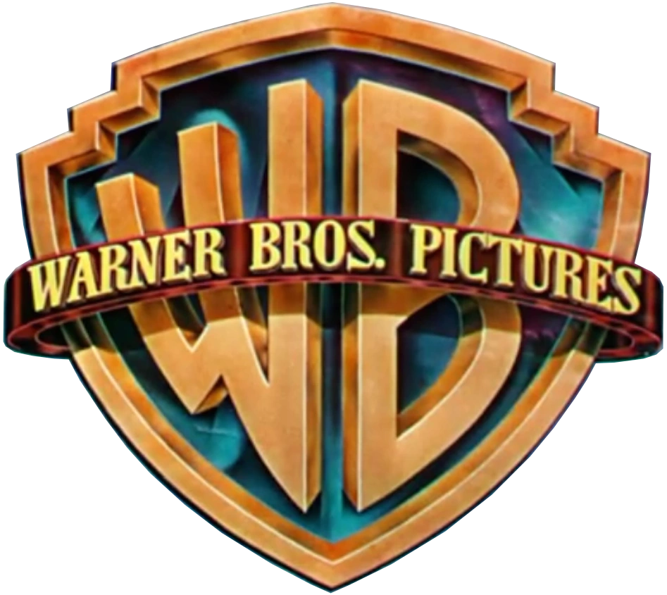
12th Logo
(January 16, 1998-November 26, 2020, March 24, 2021)[]
")
")
")
")
")
")
Nicknames: "CGI Shield", "Shield in the Sky IV", "CGI WB Shield", "WB Shield IX", "Shield of Staleness II", "Shield of Steel II", "The Reflection of the WB Backlot", "2000s Shield", "2010s Shield", "2020s Shield", "The Casablanca Logo", "Pre-Pentagram Shield", "The Golden Shield IV", "Pre-AT&T Shield"
Logo: A picture of the Warner Bros. Studios in Burbank, California is seen with a gold tint. The picture "ripples" slowly for a bit (à la the DreamWorks Pictures logo) and then rotates, revealing that it is the WB shield, redone in CGI and reflecting the studio. The cloud background is more computer generated. The shield rotates towards us and zooms out to its usual position, with the byline fading in underneath it.
Trivia: If one pauses right before the transition from the backlot image to the shield animation, some posters can be seen on the studio wall, including those for Lois & Clark: The New Adventures of Superman, Friends, and Space Jam, dating the photograph to somewhere between mid-1996 and early 1997.
Bylines:
- January 16, 1998-February 2, 2001: "A TIME WARNER ENTERTAINMENT COMPANY" (in the Garamond font in the normal variant, but in the Bodoni Condensed font in the 75 Years variant)
- On some scope films starting in 1999, the byline is noticeably larger.
- February 16, 2001-September 12, 2003: "An AOL Time Warner Company" (also in Garamond)
- On some scope films such as Training Day, the byline is noticeably larger.
- November 5-December 5, 2003: "A Time Warner Company" (in Adobe Garamond Pro)
- December 12, 2003-June 15, 2018: "A TimeWarner Company" (with "TimeWarner" in its own logo font, called Bodoni Bold, while the rest of the byline is in the FF Meta typeface)
- September 23, 2016-September 22, 2017: "A TimeWarner Company" (with "TimeWarner" in its own custom font, called Bodoni BE Regular, while the rest of the byline is in FF Meta)
- On the Warner Animation Group films Storks and The LEGO Batman Movie, the byline (excluding "TimeWarner") is in the Proxima Nova font and is smaller.
- July 27, 2018-November 26, 2020: "A WARNERMEDIA Company" (with "WARNERMEDIA" in its own logo font, called "AT&T Aleck Sans Bold", while the rest of the byline is in the standard variation of the same font)
- October 29, 2019 and March 24, 2021: "a WarnerMedia company", with "WarnerMedia" in its own logo font, called AT&T Aleck Sans (modified), while the rest of the byline is in the standard variation of the same font. (It was only seen on Godzilla vs. Kong albeit using a variant). The film uses the 14th logo at the end. It was also spotted in the first teaser trailer of Tom & Jerry and at HBO Max's unveiling at WarnerMedia Day on October 29, 2019.)
Variants:
- January 16-December 18, 1998: For this logo's first year, when the logo is zooming out, "75" and "YEARS" appear from behind the shield and move away to surround it. "Entertaining The World" fades in underneath, followed by the Time Warner Entertainment byline in white instead of orange. Also, the shield and the background are slightly enhanced. Sometimes, the banner may read "WARNER BROS."
- There is a flat/open-matte and scope version of the logo. The flat and 1.37:1 "academy" versions vertically stretches the tinted picture of the Warner Bros. studio, while the cloud background is normal. The scope and open matte versions have the tinted photo as normal and the cloud background horizontally stretches as the shield zooms out further.
- On the 75 Years montage intro, a version exists where a copyright stamp "©Warner Bros. 1998" (uppercased in the Warner Bros. banner with a space between the copyright stamp "© WARNER BROS., 1998" and the company name) fades in with the Time Warner Entertainment byline (a la the 1997 Universal Pictures logo). This appears in both 4:3 and scope.
- A French VHS promo has the "WARNER BROS."-shield variant zooming out to its place, but it freeze-frames, and the text "75 ANS A VOUS FAIRE RÈVER" fades in.
- There is a 35mm promo version, where it has a randomized vignette on the logo.
- A short version of the "WARNER BROS." variant exists on a different promo from the company.
- February 5, 1999-2011: The logo is reanimated to remove the 75th Anniversary wordings. Also, the byline is now in orange. This version would stay the same until it was reanimated once again in 2011 (not counting the changes in bylines and color grading).
- The flat and scope versions are almost identical. The reflection of the studio from the banner is the same in the scope version while it is rendered differently in the flat/open-matte version.
- A somewhat enhanced WB shield in 3D was spotted on NASCAR 3D: The IMAX Experience, Clash of the Titans, Hubble 3D, Born to Be Wild 3D, and 3D international releases of Beowulf. The animation revealing the shield is quicker, the flash reflection on the banner when the shield is revealed is not as bright, the inside of the shield is a brighter blue, the banner around the shield is shinier, the cloud background is further back, and the shield zooms out further more.
- A version of the logo exists in which Bugs Bunny walks from the shield, does a Vanna pose, and eats a carrot. This version was used for Warner Bros. Family Entertainment for a short time.
- Starting with Dolphin Tale in 2011 and up to The Witches in 2020, the shield is sleeker, the banner is shinier, the byline is orange-yellow, and the animation revealing the shield is enhanced. Some films like The Dark Knight Rises, Gangster Squad and most foreign films released by the company at the time used the 2003 version, with the last film overall using that version being the Chinese film Zhongkui: Snow Girl and the Dark Crystal, released in 2015. The shield rotating was reanimated as the rippling animation is zoomed in. In the scope version, it's zoomed in even more.
Closing Variants:
- 1998-February 2, 2001, May 17, 2002, March 5, 2004: Same as before.
- February 16, 2001-November 26, 2020: This closing logo features the 1984 shield with the banner inscription updated to match that of the current opening logo; the words "Distributed by" appear over the shield with the URL address underneath the byline. This is pretty much a modified version of the 2001 Warner Bros. Television logo. The font for "Distributed by" varies per version:
- February 16, 2001-December 5, 2003 (AOL Time Warner and prototype Time Warner bylines): Garamond
- December 12, 2003-August 24, 2018 (TimeWarner byline): Bodoni Bold
- July 27, 2018-November 26, 2020 (WarnerMedia byline): AT&T Aleck Sans Light
- A scope version of the closing logo has a much zoomed out shield, much like the IMAX variant. This was spotted on We Are Marshall.
FX/SFX: CGI by Intralink Film Graphic Design for the original 1998 and 1999 versions, Picturemill for the 2011 and New Line Cinema versions, and DevaStudios for the Warner Animation Group version.
Music/Sounds:
- January 16-December 11, 1998: The original 75th Anniversary version of this logo used a wind-blowing chime tune.
- February 12, 1999-March 24, 2021: An 8-note piano tune that builds into a powerful, moving fanfare, based on "As Time Goes By." It is a shortened version of an instrumental of "As Time Goes By" that appeared in a Warner Bros. 75th Anniversary promo that had been shown theatrically a year earlier.
- In other cases, it uses the opening theme (or in the case of Exit Wounds, dialogue) of the movie or silence. However, while A Walk to Remember normally has the fanfare, the 2022 Shout! Factory Blu-ray uses the opening theme.
Music/Sounds Variants:
- On current prints and HBO airings of The Negotiator, the 2003 version uses the original 75th Anniversary tune.
- On current prints of Innerspace and Caddyshack II, this plastered the Warner Communications version of the previous shield, but kept the horn fanfare.
- The 16mm montage intro for the 75th anniversary of Warner Bros. uses an extended version of the "As Time Goes By" theme on the 75 Years logo. The voiceover, voiced by Chuck Riley, thanks audiences around the world for celebrating 75 years.
Availability: Very common.
- Seen on most WB films from 1998 until it was retired in 2020. The first film to use this logo was Fallen and the final film to use this logo on a regular basis was The Witches, though it made one more appearance at the start of Godzilla vs. Kong (as a variant), released in 2021. The last film to use the closing variant was Superintelligence.
- The 75th Anniversary variant first appeared on Fallen and last appeared on You've Got Mail (as a variant). However, probably due to the 75th Anniversary wordings, it is almost always plastered with the 2003 version on newer prints of such films, particularly on TV airings, although some releases may retain it, such as the Blu-rays of The Negotiator and Lethal Weapon 4 (as a variant).
- The normal Time Warner Entertainment byline variant was used on films such as Analyze This, The Matrix (as a variant), Miss Congeniality, international prints of South Park: Bigger, Longer & Uncut and Payback, the first two Pokémon movies, and the infamous Battlefield Earth.
- It was also used to plaster older logos on some 1999-2001 prints of older films, such as the 2001 DVD of Superman II (where it plasters the 10th logo).
- The AOL Time Warner byline variant can be found on 2001-2003 films such as Exit Wounds, Scooby-Doo, The Powerpuff Girls Movie, and Training Day.
- Like the Time Warner Entertainment variant, it also plasters previous logos on some 2001-2003 prints of older films.
- The prototype Time Warner byline was rare and first appeared on The Matrix Revolutions (as a variant). It last appeared on The Last Samurai.
- The official TimeWarner byline debuted on Something's Gotta Give, and made its last appearance at the end of the IMAX re-release of 2001: A Space Odyssey.
- Just like the previous two byline variants, this byline plasters older logos on post-2003 prints of pre-2003 films (in addition, also plastering the 75th Anniversary, Time Warner Entertainment, and AOL Time Warner versions of the same logo).
- In fact, it is now the most commonly used logo to plaster older logos on several of the company's films, including the first two Lethal Weapon films, Superman II, The Exorcist, Mad Max 2: The Road Warrior (though the "Big W" was retained on the original 1997 DVD release), The Lost Boys, Blazing Saddles, All the President's Men, Falling Down, Return of the Living Dead Part II, and current prints of the National Lampoon's Vacation series (except all releases of European Vacation).
- Fortunately, Warner Bros. has started to ease up on this habit, and the newest prints of some of these movies that have been released in the past few years have had their original logos and bylines restored on UHD releases as well as digital prints. Some notable examples include the UHD releases of Mad Max 2: The Road Warrior, The Outsiders, The Green Mile, National Lampoon's Vacation, and National Lampoon's Christmas Vacation (as well as the 2015 Steelbook Blu-ray).
- The WarnerMedia byline version made its first official appearance on Teen Titans Go! To the Movies and was used until the logo's end on Godzilla vs. Kong.
- Unlike the TimeWarner variant, this was rarely used for plastering, as the company's plastering habits had started to slow down around this time.
- This logo may or may not be plastered by the Toho logo on Japanese prints of Godzilla.
- The Gintama anime and live action movies usually play this logo multiple times, like 3 times in Gintama: The Movie for example.
- On the 2022 Shout! Factory Blu-ray of A Walk to Remember, the Warner Bros. and Pandora logos are presented in reverse order, and the closing variant was removed completely.
Editor's Note: It held up remarkably well over the twenty-two years it was used, though some people might be annoyed due to it plastering some older logos, just like its predecessor.
13th Logo
(August 26, 2020-June 29, 2021)[]
")
")
Nicknames: "WB Shield X", "CGI Shield II", "Shield in the Sky V", "The Reflection of the WB Backlot II", , "Shield of Steel III", "Bannerless WB Shield III", "The AT&T Shield", "The Prototype 2020s Shield", "The Captain America Rip-Off Shield", "Pentagram Shield", "The Silver Shield"
Logo: It starts the same way as the previous logo (but tinted blue), then we see the new Warner Bros. shield without a banner (the border of the shield and the "WB" text are colored silver instead of gold) swing in fully upright from the left of screen against the same cloudy sky background as the previous logo. The "WB" text reflects various other clouds. As the shield zooms out into position, the sky background fades to black and the 2019 WarnerMedia byline now reading "a WarnerMedia company" fades in below. The shield shines throughout.
Variant: A still variant exists.
Closing Variant: Just the finished logo, with "Distributed by" above and the URL below. This would be the final closing variant to feature both.
FX/SFX: All CGI, albeit a bit stiff.
Music/Sounds: The opening or closing theme of the movie.
Availability: Rare, as it was a placeholder until the next logo was finished, and then quickly retired.
- It debuted on Tenet and can also be seen on Wonder Woman 1984 albeit with both films featuring variants.
- It also appeared at the end of Cats and Dogs 3: Paws Unite!, the opening of Gintama: THE FINAL and the end of A Cinderella Story: Starstruck.
- The still version can be seen on the opening of Judas and the Black Messiah.
Editor's Note: A good evolution of the previous logo, although it's far less grand due to the stiffer animation. Because of this, some people in the logo community thought that this was fan-made when it first came out, and were disappointed to find out that it was real. It's also the 1st logo since 1972 to not have a banner around the shield.
14th Logo (January 14, 2021-present)[]
")
.jpg "Warner Bros. Pictures (2021-Present).jpg (78 KB)")
_Fullscreen_Version.jpg "Warner Bros. Pictures (2021-Present) Fullscreen Version.jpg (65 KB)")
.jpg "Warner Bros. Pictures (Father of the Bride).jpg (1.2 MB)")
Nicknames: "WB Shield XI", "CGI Shield III", "Shield in the Sky VI", "Shield of Steel IV", "Water Tower Over Sunset", "The Reflection of the WB Backlot III", "CGI Reflection of the WB Backlot", "Reflection of the WB Backlot and the Water Tower", "Reflection of the WB Backlot at Sunset", "From Burbank on the Brighter Side", "Bannerless WB Shield IV", "AT&T Shield II", "Pentagram Shield II", "2020s Shield II", "The Silver Shield II", "The Casablanca Logo II", "CGI WB Backlot"
Logo: Starts off similar to the previous logos (again), but this time, instead of a simple rippling image, the camera pans across a beautiful, photorealistic CGI rendering of the Warner Bros. Studios backlot at sunset with the water tower (displaying the shield and "WARNER BROS. STUDIOS" in three rows on it, in the new corporate font, Warner Bros. Sans) taking centre-stage, á la the Searchlight Pictures logo. After a few seconds, it continues like how the previous logo did; turning upright as it zooms out like the 1998 logo, revealing a new, much more realistic cloud background. The byline fades in below as the shield shines.
Bylines:
- January 14, 2021-May 13, 2022: "a WarnerMedia company"
- June 8, 2022-: "A WARNER BROS. DISCOVERY COMPANY" (theatrical only)
- June 16, 2022-: "a Warner Bros. Discovery company" (prototype only in Father of the Bride)
Variants: At the start of the 2021 adaptation of Dune, the logo cuts in at the start. Also, the background fades to black near the end of its duration, followed by the shield and byline fading out.
Closing Variants: Just the tail end of the opening logo with no extra text.
- On the 2021 restored prints of The Outsiders, the opening logo cuts in and cuts out.
FX/SFX: Mindblowing CGI! Created at DevaStudios.
Music/Sounds: A re-orchestration of the 1998 theme, now played in a different key (this time in E♭ major). It has a more powerful build-up and the opening notes are now played on a guitar as opposed to a piano. The fanfare was composed by Ludwig Göransson. This version of the "As Time Goes By" fanfare debuted with Non Mi Uccidere on April 21, 2021 in Italy.
Music/Sounds Variants:
- Some films, most notably the first few films to use this logo, have either the opening theme of the movie or silence.
- An upload of the logo on Billy Mallery's Vimeo page has an alternate fanfare which is based on the "As Time Goes By" theme, composed by Mallery himself. It won't be used on any future films as this was a "runner up" score, meaning Warner Bros. chose a different score (the one described above this section).
Availability: Current.
- It debuted on the HBO Max original Locked Down.
- The logo with its fanfare debuted on Non Mi Uccidere and Rurouni Kenshin: The Final - Part 1, released on April 21 and 23, 2021 in Italy and Japan, respectively.
- This also appeared at the end of Judas and the Black Messiah, despite using the previous logo at the beginning of the film, and also at the end of Godzilla vs. Kong, despite the 12th logo appearing at the beginning of the film. This is likely because of both films being delayed due to real-world events.
- This plasters the 12th logo on the extended version of Zack Snyder's Justice League (the theatrical cut still retains it) and at the end of YouTube's print of Thirteen Ghosts, originally released in 2001.
- It was used in tandem with the previous logo until mid-2021.
- The last film to use the logo with the WarnerMedia byline was Operation Mincemeat, due to the company merging with Discovery, Inc. through AT&T on April 8, 2022. As a result, the logo became bylineless in newly-released trailers and TV spots for then-upcoming films, such as Father of the Bride, Elvis, DC League of Super-Pets, and Don't Worry Darling. The logo did eventually gain a new byline under the Warner Bros. Discovery name in the trailer for Black Adam, with Father of the Bride being the first film to use this.
Editor's Note: A much more fulfilling effort from Warner Bros. this time around, with more realistic effects. It's a worthy successor to the 1998 logo. Contrary to today's trend of boring and simplistic logos, this logo has beautiful animation, alongside the gorgeous fanfare.
15th Logo (June 16, 2023-present)[]
.png "Warner Bros. Pictures (2023).png (5.1 MB)")
Nicknames: "WB Shield XII", "CGI Shield IV", "Shield in the Sky VII", "Shield of Steel V", "Water Tower Over Sunset", "The Reflection of the WB Backlot IV", "CGI Reflection of the WB Backlot II", "Reflection of the WB Backlot and the Water Tower II", "Reflection of the WB Backlot at Sunset II", "From Burbank on the Brighter Side II", "AT&T Shield II", "Pentagram Shield III", "2020s Shield III", "The Casablanca Logo III", "CGI WB Backlot II", "The Golden Shield V", "Return of the Golden Shield"
Logo: It's almost the same as the previous logo, but the water tower on the studio lot now has the new Warner Bros. shield (with its banner) introduced in 2023. The image now ripples slightly (a call-back to the 1998 logo) before it reveals the new shield, which is the WB shield from the Warner Bros. Discovery logo. It is in gold with its inside in blue and features a banner that has the company's name in the Warner Bros. Sans font on it. Once the camera settles, the Warner Bros. Discovery byline fades in, but earlier than usual. The shield then shines before the logo fades out.
Bylines:
- June 16-August 18, 2023: "A WARNER BROS. DISCOVERY COMPANY" in the Warner Bros. Sans font. This was only used on two films, both from the DC Extended Universe: The Flash and Blue Beetle.
- October 24, 2023-: "A WARNER BROS. DISCOVERY COMPANY", in the same font as the previous logo (Geograph Medium, with "WARNER BROS. DISCOVERY" in bold and the rest of the byline remaining in the standard version of the font).
Variant: On The Flash, Blue Beetle and the trailers for Dune: Part Two, the shield lacks its banner, like the previous two logos. There is no standard version of this logo with the bannerless WBD shield. This is likely considered to be a secondary logo before the logo actually debuted.
FX/SFX: CGI by Devastudios, who also did the previous logo.
Music/Sounds: So far, none or the film's opening theme.
Availability: Current. Used in tandem with the previous logo as of this writing.
- It debuted on The Flash as both a variant and a prototype, as of being the studio's secondary logo at the time (the previous logo appears at the end).
- The normal logo debuted on the trailer for the Philippine film Mallari as a variant, while the fully animated version debuted on Wonka.
Editor's Note: A wonderful update of the previous logo, now utilizing more elements from the 12th logo.
Copyright Stamps[]
Here is some information about the copyright stamps on the Warner Bros. films:
- 1923-1967: Copyright © by Warner Bros. Pictures, Inc.
- 1934-1936: Copyright © by Warner Bros. Productions Corp.
- 1926-1960 :Copyright © by The Vitaphone Corp. (short subjects only)
- 1967-1970: Copyright © by Warner Bros.-Seven Arts, Inc.
- 1970-1992: Copyright © by Warner Bros., Inc.
- 1992-2003: Copyright © by Warner Bros.
- 2003-present: Copyright © by Warner Bros. Entertainment, Inc.
Click here for logo variations.