Background[]
The Corporation for Public Broadcasting (CPB) is a non-profit corporation created by the Public Broadcasting Act of 1967, signed into law by U.S. President Lyndon B. Johnson on November 7 of that year. It was created to provide partial federal funding for public broadcasting, initially collaborating with National Educational Television (NET) stations before starting their own private non-profit networks, Public Broadcasting Service (PBS) for television and National Public Radio (NPR) for radio.
For a list of how its logos specifically appeared on CPB-funded programs, see this page.
General logos[]
1st logo
(1967-1970s)[]
Logo: On a gray background we see an abstract design - the lowercase letters "c," "p" and "b" stacked together like a mixed up jigsaw puzzle - and the text "Corporation for Public Broadcasting" written below in a serif font.
Effects: None.
Music/Sounds: None. However, there is a voiceover that says, "Nationwide distribution of the preceding program is a service of the Corporation for Public Broadcasting."
Availability: Very rare. Can be found at the end of a 1970 episode of Firing Line, available to view at the Paley Center in New York and Los Angeles. It was also known to be seen on a 1969 episode of Black Journal.
Editor's Note: The logo's abstract design is a throwback to mid-century abstract graphics.
2nd logo
(1967-August 31, 2001)[]
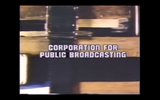
Logo: Just the company name. There are many font, color, and ALL CAPS variations, a growing list of which can be found here.
Variations:
- On Mister Rogers' Neighborhood episodes from 1993-2001, the byline "A private corporation funded by the American people" (more commonly seen with the 6th logo and beyond) is added.
- WNET-produced programs from between 1978 and 1983 will have this in the WNET logo's font at the start (and oftentimes also at the end).
Effects: None.
Music/Sounds/Voiceover: The text has no music of its own, but on several shows of the era it plays over the opening and closing themes. There are at least three voice-over variations:
- "[PROGRAM NAME] is made possible by funding from the Corporation for Public Broadcasting."
- "Additional funding provided by the Corporation for Public Broadcasting."
- "Funding for this series was also provided by the Corporation for Public Broadcasting."
Music/Sounds Variants:
- On Mister Rogers' Neighborhood, the logo is silent, and a male announcer would say the following: The people who give the money to make Mister Rogers' Neighborhood, are the people...
- ...of this and other public television stations, and the Sears-Roebuck Foundation. (This and the next three are used in reruns of earlier episode.)
- ...who contribute to this and other public television stations...
- ...and the Sears-Roebuck Foundation.
- ...the Corporation for Public Broadcasting, and the Sears-Roebuck Foundation.
- ...and the Corporation for Public Broadcasting.
- ...who contribute to this and other PBS stations, and the Corporation for Public Broadcasting. We thank you. (This was used in the final two seasons.)
Availability: Preserved on DVDs, iTunes and Amazon Instant Video releases of PBS shows such as Sesame Street and The Electric Company. Nova, Great Performances and 3-2-1 Contact will also likely have variations of this logo intact if reissued. The last known show to use this logo was the series finale of Mister Rogers' Neighborhood in 2001. However, while Amazon's prints of 1970-75 episodes retain this logo, later episodes have all funding credits removed. This also appears on season 2 episodes of The American Experience.
3rd logo
(September 28, 1981-July 4, 1982)[]
Nickname: "CPB Curves"
Logo: Just a stylized "cpb" with the company name below. Sometimes, "The Program Fund" will appear above the company name.
Effects: None.
Music/Sounds: Same as the 2nd logo.
Availability: Extremely rare. Seen on some Season 9 episodes of Great Performances, including a trilogy of adaptations of works by Edith Wharton, and the first season of American Playhouse.
4th logo
(July 11, 1983-March 5, 1990)[]
Nicknames: "CPB Circle", "The Chuck Barris (CBP) Rip-off"
Logo: Just a circle with a stylized "CPB" cut into it on a colored background, with the phrase:
CORPORATION
FOR PUBLIC
BROADCASTING
underneath.
Variations:
- There were many font variations, but the most common are:
- All-caps, serif font, regular size;
- All-caps, serif font, smaller size (often with a bigger CPB circle); and
- All-caps, Haettenschwelier font.
- Sometimes, as seen on Alive from Off Center, The MacNeil/Lehrer NewsHour, and Jukebox Saturday Night (among others), this was superimposed.
- A centered version of the circle appears without the text on WGBH's Don't Look Now.
- On the ninth season of The MacNeil/Lehrer NewsHour (and the first season under that name), the circle appeared at the right, with the company name to the left.
Effects: None.
Music/Sounds: Same as the 2nd logo.
Availability: Preserved on 1983-87 episodes of Reading Rainbow and season 1 episodes of The American Experience, among others.
Editor's Note: As said by one of the nicknames, the logo does bear a striking resemblance to the Chuck Barris logo and would continue to go up all the way until 2002.
5th Logo
(October 1, 1984-November 29, 1987, September 1, 1991-May 1, 1992)[]
Nicknames: "CPB in a Circle II", "Chuck Barris (CBP) Rip-off II"
Logo: Same as the fourth logo, but this time the background is a black/purple gradient. The whole thing also has a drop shadow.
Variants:
- The first few programs that had this logo, including 1985 episodes of Reading Rainbow, omitted the drop shadow.
- On some later programs, including season 1 episodes of Square One TV, the text was smaller, as the CPB circle took up half the screen.
- 3-2-1 Classroom Contact used the aforementioned variation, but on a dark red background.
- On Nuclear Legacy from 1986, the aforementioned variation took place on the 3rd logo's background.
- On first and second season episodes of Degrassi Junior High, the CPB logo on a black background, is blue-violet with a fuchsia diagonal line sweeping by. Plus, all the text is set in the Haettenschwelier font for some reason.
FX/SFX: None.
Music/Sounds/Voice-over: Same as the 2nd logo, although a few episodes of Degrassi Junior High lacked the voice-over.
Availability: As rare as you can get without extinction. Preserved on 1985-87 Reading Rainbow tapes. This was also used on season 1 episodes of Square One TV, The Ring of Truth, 3-2-1 Classroom Contact, Degrassi Junior High, and Frontline, among others.
6th logo
(November 30, 1987-December 22, 1995)[]
Nicknames: "CPB Circle III", "The Chuck Barris (CBP) Rip-off III", "CPB in Space"
Logo: The whole thing takes place on a space background with stars zooming past. The CPB logo is now in 3-D, and the circle is colored blue and white. First, we see it slowly rotating towards the center. Afterwards, the name pops up like this:
CORPORATION
FOR PUBLIC
BROADCASTING
Variations:
- Sometimes, a still version of the logo, with only the stars being animated, was used.
- On Where in the World is Carmen Sandiego?, the Earth is behind the whole thing, and on 1993-1996 episodes, the byline used in the next logo is seen below the text. On the series premiere, "The Taking of the Shrew", this only appeared at the start, with the standard version appearing at the end.
- A variant with more stars can be seen on 1990 episodes of The MacNeil/Lehrer NewsHour.
- An earlier variant, as seen on season 2 and season 3 episodes of Square One TV put this logo on a black/purple gradient background.
- Some shows, like Great Performances, had the logo superimposed over a specialty backdrop.
- The logo may also fade away to make room for the text "Viewers Like You", which contains the words "Viewers Like" (in a small font either Garamond or Arial) with "you" sketched below in yellow script. This happened on many post-1989 shows. After being sketched, the yellow script glows in Where in the World is Carmen Sandiego?, the 1990 documentary series Fire on the Rim, Degrassi High and in the 1993 documentary series 21st Century Jet. For the first season of Degrassi High and the 1993 documentary series 21st Century Jet, the words "Thank You" (in the same Garamond font as the "Viewers Like" words) would fade in on the bottom right corner of the screen after the yellow script glowed.
- On Where in the World is Carmen Sandiego?, the "Viewers Like" words are in capitals and in a Futura Condensed Bold font.
- On 1989 episodes of Frontline, the text is set in the Haettenschwelier font, just like the Degrassi Junior High episodes. (On a side note, Degrassi episodes with this logo use the regular variant.)
Effects: None.
Music/Sounds: Same as the 2nd logo.
Availability: Rare.
- Preserved on 1989-91 Reading Rainbow tapes.
- The animated variant also appeared on 1987-91 episodes of The MacNeil/Lehrer NewsHour, Degrassi Junior High, WonderWorks, Great Performances, and Amigos, and the still variant also appeared on Where in the World Is Carmen Sandiego?, The Civil War, Long Ago and Far Away, American Playhouse, season 3 episodes of The American Experience, and American Masters.
- The standard space background variant was last seen on The Dancing Man: Peg Leg Bates, which premiered on PBS stations on February 11, 1992.
Editor's Note: This logo is a favorite to longtime PBS viewers.
7th Logo
(September 30, 1991-February 22, 1996)[]
Nicknames: "CPB in a Circle IV", "Chuck Barris (CBP) Rip-off IV"
Logo: The CPB circle has been redesigned, with a blue and lavender outline around it and in the letters. The whole thing takes place on a black background. On some 1993-1996 shows, a new byline "A private corporation funded by the American people" in a condensed white Garamond font appears below.
Variant: On American Experience, before the byline was introduced, the CPB logo had a brighter blue color scheme.
FX/SFX: None.
Music/Sounds/Voice-over: Same as the 6th logo.
Availability: Pretty rare. Mainly seen on American Experience. It has been preserved on PBS Video tapes from the time.
8th logo (July 1, 1991-2002, October 27, 2020)[]
Nicknames: "CPB Circle II", "The Chuck Barris (CBP) Rip-off II", "Merging CPB Circles", "Sweeping Pink Lines"
Logo:
- September 29, 1991-April 28, 2000: On a textured cobalt blue/purple background with occasional thulian pink comets flying past, two circles slide in and form the CPB logo above the white text:
- CORPORATION
- FOR PUBLIC
- BROADCASTING
- After a few seconds, the text fades out as the logo splits into two CPB logos flying off to opposite sides of the screen so that the words "Viewers Like You" (in plain white plain serif text this time) appear in its place near the top, as more comets fly diagonally upward. For this version, the "Viewers Like You" text sometimes fades out earlier, so the background is shown for about one second before completely fading out.
- March 22, 1993-2001: byline from the 6th logo was added under the text. At that time, the text above was arranged centered and appears earlier, before the sweeping pink lines. Also, the CPB logo, smaller to make room for the byline, has a steel blue/opera mauve color scheme instead of the casual blue/lavender one, which is only used on still and superimposed variants.
Variations:
- Like the 3rd logo, some shows superimpose the logo over a specialty backdrop, with NOVA being one example.
- A still version is seen on some programs.
- Some shows do not use the text "Viewers Like You".
- Some shows just use the text, and not the circle.
- Some shows, like 1990 episodes of Frontline, just use the circle, and not the text.
- Some shows, like season 2 episodes of Wishbone, just use "Viewers Like You."
- On shows which feature the still version of the CPB logo, the text "Viewers Like You" is dead center and often larger.
- On 1991-1993 episodes of NOVA, the CPB logo has its brighter blue color scheme from the 6th logo.
- On 1991-1995 episodes of Sesame Street, the logo fades out (instead of the CPB logo splitting into two CPB logos) to make room for "PUBLIC TELEVISION STATIONS AND THEIR CONTRIBUTORS".
- On some shows, particularly those produced by WGBH Boston, would feature a still version of the logo superimposed over a background unique to that show.
- On 1997 reruns of Barney & Friends episodes from seasons 1-3 and original broadcasts of episodes from season 4, the CPB logo is already formed for a few seconds, before it splits into two CPB circles, and reveals "Viewers Like You". This variant also lacks the sweeping lines. A rare superimposed version of this variant's animation, using the 1991-1993 design, was used on 1991-1992 episodes of Great Performances.
- Starting on November 1, 1999, the text "Thank You" follows "Viewers Like You". This is often customized for the particular show.
- On The Charlie Horse Music Pizza, the logo is a solid ultramarine color with "The Corporation for Public Broadcasting" and the usual byline below it in the Ad-Lib font, all against a stylized musical-oriented background.
- On Club Connect and the Season 1 episodes of Dragon Tales, the "sweeping pink lines" and the two big circles move slower, and the text appears after the logo (in brighter colors) is formed; also, the design is of the original 1991-1993 version, without the byline.
- On 1998-2001 episodes of NOVA, a bold Century Gothic font was used. On at least one or two episodes, the text is not bold.
- Ghostwriter used an animated sky background with two pinwheels forming the CPB circle. In later episodes from 1993-1995, the background was replaced with an animated aquamarine background with jacks. Sometimes, it was superimposed in the credits along with the PBS logo (the P-Heads on top of the "PBS" letters, like the 3rd and 6th PBS logos) in yellow.
- On Kratts' Creatures, the CPB circle is transparent.
- On 1995-1998 episodes of Sesame Street, the whole text is bigger and written in cursive, and the logo is shown on the top left of the screen with the byline in its regular font. The background takes place behind a green curtain.
- On 1999-2002 episodes of Reading Rainbow, the logo takes place on a nighttime background with swirling rainbows flying around.
- On 1995 episodes of The Puzzle Place, the logo (with byline) is still, then, a set of CGI puzzle pieces (the same ones that are the background for the other variant for this show) fly towards the logo, fit together, and then fly off the screen, revealing the SCE Corp funding tag. On 1996 episodes, the Puzzle Place logo is shown, then the puzzle pieces in the background disappear one by one to reveal the CPB background, and as the PP logo fades out, the standard CPB animation plays.
- On The Prize: The Epic Quest for Oil, Money, and Power, The Longest Hatred and the closing to MotorWeek '92, both the CPB logo and "Viewers Like You" are shown at the same time.
Effects: The lines and the circles sliding.
Music/Sounds: Same as the 5th logo. Sesame Street episodes from 1991-1992 used the famous "Funky Chimes" as background music, while Sesame Street episodes from 1992-1995 used a hip-hop instrumental based on the Sesame Street theme, and Sesame Street episodes from 1995-2000 used a jazzy version of the Sesame Street theme. The voice-overs are the same as the first logo.
Music/Sounds Variants:
- On all Sesame Street episodes with this logo from 1991-1995, the announcer (Gordon [Roscoe Orman] or Gabriela Rose Reagan [Gabi]) says "Funding for this program is provided in part by the Corporation for Public Broadcasting... and by public television stations and their contributors."
- On 1995-98 episodes of Sesame Street, a kid this time says "Funding for Sesame Street is provided in part by the Corporation for Public Broadcasting and by public television stations and their contributors."
- On 1998-2000 episodes of Sesame Street, the 1991-95 announcer says this time "Funding for Sesame Street is provided by the annual financial support of PBS Viewers Like You."
- Sometimes, for example, on 1989-91 episodes of NOVA, the announcer uses, "...the financial support of viewers like you", even though "Public Television Viewers/Stations" is shown on the screen.
- Starting on November 1, 1999, the "viewers like you" spiel is changed to "Contributions to your PBS station from viewers like you (or "...and [PBS] viewers like you.") Thank you." The spiel varies from show to show. For example, on the revivals of Zoom, the Zoomers shout "Thanks!" instead, and the announcer for Mister Rogers' Neighborhood utters "We thank you."
Availability: Pretty common.
- It has been preserved on reruns of 1991-2000 PBS programs, even when the current PBS logo is plastered over a previous logo. Also preserved on PBS Home Video tapes and DVDs of the era.
- The byline variant, which first appeared on the Shining Time Station episode "Becky Makes a Wish", is much easier to find and can be spotted, for example, at the end of at least one or two episodes on a few of The Magic School Bus VHS and DVD releases and on PolyGram tapes of Wishbone that end with the Big Feats! logo, including "Salty Dog" (on such Wishbone tapes, this will inevitably be followed by the 1993 PBS Kids logo). It also assists the plastering of the previous funding credits for post-1994 prints of David Macaulay's Castle and Cathedral.
- This logo was last seen on Dragon Tales reruns on PBS Kids Sprout and can be also found on the VHS/DVD releases of the show.
- On DVD, the standard animation of the 1993 logo can also be found with the Ken Burns documentaries Baseball and Thomas Jefferson, and the Rick Sebak documentary, An Ice Cream Show.
- The solo "Viewers Like You" variant made a surprise appearance on Not Done: Women Remaking America, broadcast on October 27, 2020.
Editor's Note: Much like the 6th logo, this is a favorite to most PBS viewers.
9th logo (November 9, 1998-2001)[]
Nickname: "Chuck Barris (CBP) Rip-off logo IV"
Logo: On the same background as the 7th PBS logo, we see the CPB print logo, in black, centered on the screen. This time, no text or byline is shown. The logo is then usually followed by the "Viewers Like You" and "Thank You" disclaimers, which are often custom-made for the particular show.
Variations:
- Though this is one of the few logos to lack the text or byline, another variant of the regular logo exists with the byline from before, which has two different arrangements.
- The superimposed variants during this era often have the CPB circle in white.
- On In the Mix, the CPB logo is only followed by the "Thank You" disclaimer.
Effects: The background.
Music/Sounds: An extended version of the 7th PBS logo's music, albeit entirely on guitar. The voiceover is the same as on previous CPB logos. The music is also used on 2000-2004 episodes of Scientific American Frontiers, using the "Viewers Like You" disclaimer without the CPB logo.
Availability: Very rare. In fact, it's probably the one of rarest of the CPB logos. It may appear on PBS programs from 1999-2001 if your station has older prints. Also seen on a few PBS Home Video tapes of the era.
Editor's Note: None. It's a peaceful logo.
10th logo (2000-2015)[]
Nickname: "CPB in a Square"
Logo: On an aqua background, blue and white dots appear in the center of the screen and form the CPB logo, which has been redesigned yet again, this time looking like a square with "cpb" in it. The "p" and "b" are connected to the edge of the square. The same byline appears underneath in all capitals, but with "CPB.ORG" at the end in blue.
Variations:
- On Life 360, the whole thing is on a black background.
- On several shows, a still version is superimposed over the credits of that show.
- Some shows, like Nature, just use "Viewers Like You."
- On American Experience, the logo is in gold.
- On late 2002-2014 reruns of episodes of Arthur from seasons 1-4, the second half of the Arthur funding showed the logo fading in after the US Department of Education logo faded out, either on a velveeta cheesy yellow background, a grassy green squared background, or a concord grape jelly purple checkerboard background (the backgrounds used for episode title cards of Arthur). Then, after the CPB logo faded out, the Viewers Like You Text fades in, then fades out, and the Thank You Text then fades in. On TV airings from late 2002-04, and on DVD releases of Arthur from Sony Wonder, the 2000 PBS Kids Dash Transformation system cue came after the funding on the yellow or green backgrounds, while the 2000 PBS Kids Dot Transformation system cue came after the funding on the purple background.
- On PBS Kids shows, such as Clifford the Big Red Dog, Reading Rainbow, Sesame Street, and Season 2 of Dragon Tales, there is a certain background with two halves of different colors. On the bottom half, there is a kid's head, and on the top half, there is a thought bubble, transforming from two different objects to another kid's head. For the Ready to learn grant, the logo consits of the PBS Kids circular logo with the Ready To Learn words in purple. Sometimes, the words Ready to Learn Television Cooperative agreement in red would appear instead. The top half is yellow, and the bottom half is blue. For the US Department of Education logo, the top half is orange, and the second half is green. For the Public Broadcasting Service and CPB logos, the top half is red, and the bottom half is yellow, and a girl's head is placed on the bottom right. On 2002-2004 episodes on Sesame Street, 2002-2003 episodes of Clifford the Big Red Dog, and 2003-2006 episodes of Clifford's Puppy Days, the PBS Kids circular logo is shown before the CPB logo appears.
- There is another PBS Kids variant that lacks the heads and thought bubbles, while the logos are centered on the screen. The top half is yellow and bottom half is blue, and the Ready to Learn and No Child Left Behind logos are centered Also, the CPB logo appears on the top half orange, bottom half green background, after the US Department of Education logo is shown centered on the same background . On Dragon Tales, there is an additional third screen with "Viewers Like You" centered on the red top half with the girl's head shown without the thought bubble.
- Some shows, like Between the Lions, do not use "Viewers Like You."
- On Reading Rainbow and some prints of Dragon Tales, the blue dots bounce off the bottom of the screen, then onto the middle and form the CPB logo. The URL slides in to the top left of the screen. Then, the byline fades in at the bottom and forms a smile.
- On 2005-2007 episodes of Great Performances, the logo looks more like a rectangle, apparently due to some sloppy digital manipulation.
- On recent prints of Clifford the Big Red Dog, the three logos are seen on a striped background from the 1999 PBS Kids logo.
- Also on said show, Viewers Like You is in blue words, with Clifford book above, on a grassy background
Effects: The blue dots forming the CPB logo.
Music/Sounds: The music consists of a futuristic synth tune as the dots appear, followed by a woodwind note as the CPB logo wipes in. This is followed by three ascending notes gradually performed on brass. The voiceovers are the same as previous logos. The Reading Rainbow variant has a weird Moog synth tune with kids claiming, "WHOA!", followed by a muffled "mmmm..." when the byline forms a smile. Sometimes, this is silent, or else uses the opening/closing theme of the program.
Music/Sounds Trivia: The music used in the funding variants made its first appearance in a 1999 PBS ID.
Music/Sounds Variants:
- On PBS Kids programming, a catchy, funky, synthesized tune with drumbeats is heard.Charlie (from Clifford The Big Red Dog Season 1), Cleo (from Clifford the Big Red Dog Season 2,), a female announcer (from Reading Rainbow) or 2 male announcers (from Dragon Tales) can be heard saying the funding.
- The Arthur variant from seasons 1-4 re runs, (with the yellow, green, or purple backgrounds) had Mrs. Read (Sonja Ball) say "And by, a grant from the United States Department of Education, through the Corporation for Public Broadcasting, and by contributions to your PBS station from Viewers Like You. Thank You. The instrumental of the Arthur theme plays in this version.
- On Sesame Street, the same animation is used, and an orchestrated version of the Sesame Street theme is heard. Gordon says the funding credits.
Availability: May appear on PBS programs from 2001-2006 if your station has older prints. Also seen on a few PBS Home Video tapes of the era. While the superimposed variants are more common, the blue dots version is close to being rare, although the Reading Rainbow variant can be easily found on current DVD releases of the show. The PBS Kids variants can currently be found on Super Why!, and Clifford the Big Red Dog, while Sesame Street still carries the centered version of the CPB logo
Editor's Note: It should be said that despite the shape change, the "cpb" text looks even more like the Chuck Barris logo.
11th logo (Fall 2002-July 2, 2013)[]
Nickname: "CPB in a Square II"
Logo: On a blue/purple/red ethereal background with silhouettes of random people doing various things, the CPB logo wipes in horizontally, and a byline appears. During all of this, the PBS P-Head (the 4th PBS logo's size) is shown in the background, moving up and down, left and right, etc.
Variants:
- A widescreen variant was introduced in 2005. In this version, the byline and URL are slightly altered.
- Starting in 2007, the background and the logo were graphically enhanced, with the silver tinted CPB logo with a shine instead of white. The byline and URL were altered in the same silver and shine color as on the CPB square logo. The wiping in of the logo is quickly. Then, followed by the letters "Viewers Like You" and "Thank You" in same silver and shine color as heard on the CPB logo.
- On several shows like Washington Week (where this specific animation persisted until at least 2011), the animation (or simply a still version) of the logo is superimposed.
- On A Place of Our Own, the logo is black.
- On current episodes of NOVA and Fetch! with Ruff Ruffman, the logo features a royal blue line sweeping by.
Effects: The wiping in of the CPB logo.
Music/Sounds: Several variations of the 2002 PBS logo's music have been used so far. The VO is the same as the 8th logo.
Availability: Should be preserved on 2002-2010 PBS programs funded by CPB if your station has older prints. The fully-animated version continued to appear superimposed on WETA programs such as Washington Week and In Performance at the White House until at least 2013. Its last known appearance was on a rebroadcast of The Statue of Liberty. The "Viewers Like You" portion surprisingly reappeared on recent rebroadcasts of The Adirondacks.
Editor's Note: None.
12th logo (March 24, 2010-2021)[]
Nicknames: "CPB in a Square III" "Colorful CPB"
Logo: On the 10th PBS logo's bubble background, the CPB logo in white appears in a similar way to the previous logo as it zooms out, and a byline appears.
Variations:
- On Washington Week (on which it started appearing as early as 2011) and some other programs, the whole animation is superimposed.
- Starting on June 1, 2015, the company name, aligned to the left, appears below the square, and the byline is a single line of text, without the URL. However, Washington Week continued to use the earlier variant until June 26, 2015, and it made a surprise appearance on the November 6, 2015 and November 20, 2015 editions, after Boeing returned as a sponsor. The last known program to intentionally use the earlier variant is America After Charleston, broadcast on September 21, 2015.
Effects: The wiping in of the CPB logo.
Music/Sounds: A variation of the 2009 PBS logo's music. The VO is the same as the 8th logo.
Music/Sounds/Voice-over Variant:
- As with the previous logo, Frontline used a variant reversing the CPB and "Viewers Like You" credits.
- Nova, in referring to public television viewers, had its shortened announcement say, "...and by PBS viewers like you. Thank you." Some episodes, however, used the standard full voiceover until the 2015 variant was introduced.
- On most programs funded by public television viewers but not CPB, including pledge drive specials and pre-2014 DVD and Blu-ray releases of Masterpiece, the Viewers Like You voiceover said, "Explore new worlds and new ideas through programs like this, made available for everyone through contributions to your PBS station from viewers like you. Thank you."
- Tavis Smiley had the program theme play over this.
Availability: Common. The orange variant variant is the most common and even plasters over the 9th logo on In Julia's Kitchen with Master Chefs, the 11th logo on Carrier, and the 10th logo on Jazz. The magenta variant is typically used for superimposed variants, including on Finding Your Roots. The blue variant appeared on PBS NewsHour until July 17, 2015, and is also used for the superimposed variant on most editions of Washington Week beginning on June 29, 2015. This premiered just a few months after its solo Viewers Like You counterpart.
Editor's Note: None.
13th Logo (2019-2021)[]
Logo: TBA
FX/SFX: TBA
Music/Sounds/Voice-over: TBA
Availability: TBA
14th Logo (November 11, 2019-)[]
Logo: TBA
FX/SFX: TBA
Music/Sounds/Voice-over: Usually the same as before, though The Transformational Power of Yoga and Loretta Lynn: My Story in My Words use the extended version of the 2019 PBS logo's "Nature Walk" music variant.
Availability: Current. First seen on The Warrior Tradition. May appear on NOVA, Washington Week, PBS NewsHour, Wild Kratts, Arthur, Hero Elementary, Elinor Wonders Why, and some other shows from PBS.


